


The world of modern logo design is constantly changing, and new trends can significantly affect the perception of brands. Looking at this year’s innovations, we can highlight several key trends that are shaping the look of logos. Understanding which logos are trendy in 2025 will allow companies to create a recognizable image and stand out from the competition.
The Demand for Minimalism
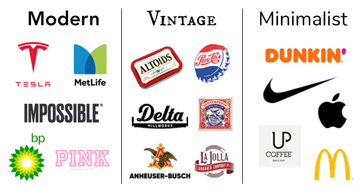
Minimalism remains a dominant trend in logo design, but it’s not standing still. Designers are experimenting with negative space and subtle color gradients to add depth to such designs.
This trend has recently taken hold in the digital design world. There are a few reasons for this.
First, simplified logos are more visually appealing on screens.
Additionally, displaying fewer pixel elements means faster loading times.
Another notable point about all this is that such a design looks great at both small and large sizes. This means that it can be embedded in almost any object and the logo will still look high-quality.
Many companies have seen the potential of minimalism in logo design in terms of marketing value. As a result, many brands have moved from complex logos to simpler ones. These include Starbucks, Apple, and McDonald’s.
Custom Printing
One of the 2025 logo trends is the flexibility of customization, which allows designers to experiment with different styles, combining tradition with modern innovation.
Here, custom printing adds a unique character to the design. This approach allows for greater creativity and ensures that no two logos are the same.
Pay attention to elements such as letter spacing, thickness, and shape to ensure that your typography is both legible and unique. Tools like Adobe Illustrator or FontForge can help you refine your design with precise adjustments.
Benefits:
Improves brand recognition.
Creates a unique identity that resonates with your target audience.
A unique font can be registered as a trademark, providing legal protection and preventing others from using similar designs.
3D and isometric designs

With the development of digital design tools, 3D and isometric logos are becoming more accessible. These effects add depth and realism, making the logo more tangible and engaging.
Through the use of lighting, shadows, and angles, 3D logos give brands a dynamic, realistic feel that draws attention. This trend is especially suitable for brands in the gaming, technology, and entertainment sectors, where visual interaction is key to brand recognition and appeal.
Key features:
Use of depth and shadow for a realistic effect.
Strong geometric and spatial elements.
Ideal for brands focused on technology and entertainment.
Bold colors and gradients
Gradients have once again become a popular tool for adding depth and dimension to stylish logos. This trend is in line with the increasing use of digital platforms, where color can play a significant role in user engagement.
In the coming year, expect bright gradients that create dynamic, eye-catching designs. This trend works especially well for technology companies and brands that strive to communicate innovation.
Rather than simply mixing colors, designers are taking a more creative approach. They are experimenting with related hues to create interesting and playful color combinations.
Implementation strategy:
Experiment with color combinations that evoke the right emotions for your brand.
Consider color psychology when choosing a color palette.
Combine gradients with textures and patterns to create unique visual effects.
Hand-drawn logos

Handmade designs often feature organic shapes, rough lines, and earthy colors that give a brand a unique and personalized look. They are especially popular in industries that emphasize sustainability and handmade quality, where the logo itself can reflect the company’s ethos.
Characteristics:
Organic, imperfect shapes and lines.
Contrary to digital trends, hand-drawn logos retain their long-lasting appeal.
Hand-drawn elements can be adapted to different styles.
Stylish geometric logos
Geometric shapes are ideal for logos that need to be symbolic. Curved edges convey lightness, squares convey a sense of strength, triangles convey stability, and so on. These are positive attributes that companies would like to associate their brand with.
Designers give shapes a warm, cheerful look to evoke a sense of calm and happiness. However, perhaps the biggest advantage of geometric logos is the simplification of complex shapes. Logos can be placed on both small and large objects, screens, etc. Therefore, it is important that they remain distinguishable even at small sizes. Good geometric design ensures that a small version of the logo is not reduced to a random scribble.
Key features:
Geometric shapes in logos carry symbolic meaning.
Geometric logos appeal to modern brands with their minimalist aesthetic.
Designers can modify or combine basic shapes to enhance uniqueness while maintaining geometric simplicity.
Retro revival
Nostalgia continues to be a powerful force in design, and retro logos are making a comeback. Designers are taking inspiration from the aesthetics of the 70s, 80s, and 90s, adding bold colors, vintage typography, and classic motifs. The result is a dynamic mix of old and new that resonates with different age groups.
Key elements of vintage:
The presence of soft tones (beige, cream, pastels) as well as earthy tones (brown, green).
Text is centered and framed by elements. Layered elements match icons, text, and banners.
Worn, grainy, or faded effects for a retro aesthetic.
This trend not only plays on consumers’ emotions, but also offers versatility, allowing brands to give a modern twist to outdated visuals while maintaining a fresh design while drawing inspiration from the past.
